Saturday, November 12, 2011

Punctuation booklet

The draft of a small booklet about punctuation.
I was inspired by the famous building Habitat 67.
The first page is the cover. The rest is 4 of the insides pages. The back of these pages create a pop up illustrating the concept. The ponctuations are made from boxes with different sizes. The placement of these boxes actually create a space/structure like Habitat 67.


Saturday, October 8, 2011

IF: contraption

The third page of my watercolor Moleskine. I'm feeling guilty for letting it covered with dust at the corner of my desk. These days people often ask/prefer digital works from me, "because it is faster and easier to revise", they said. It is true but sad. I still believe a pencil and a dream can take me anywhere. 

Sunday, August 21, 2011

IF: influence


This is me under the influence of the difference trainings I got. And I appreciate the blurred boundary between art & design.
The illustration is burned on a piece of plywood. Handmade, of course.

Friday, August 5, 2011

IF: imperfect


Like many designers, I'm a perfectionist. I look for the perfection in any art field that I come across. But I really appreciate the beauty of imperfection in pottery, especially the Wabi Sabi concept in japanese pottery Raku. It is literally the human touch that create the beauty. And we human being are imperfect.

Work, work, and work...


A draft for a bookcover I'm working on. The cover may turn out very different. We'll see...
Managing 3 blogs and one online portfolio is really time consuming. 
I'm still working on my unB[  ]X project. So far I have finished the logo and the type display.  I was trying to figure out how to present the work on unB[ ]X your creativity, the blog created just for this project. I wanted to change the layout of the blog to have a better layout. This involved the coding part behind the blog which is quite complicated. After all, I gave up the on screen presentation and decide to concentrate on the work itself. I also want to bring my online portfolio from Krop database to Tumblr.
So I'm planning to have 2 blogs: unB[ ]X your creativity (only for unB[  ]X project), Square of the day (only for photography); and my online portfolio on Tumblr; then this blog as an online journal. Lots of work here and there. Well, summer is cleaning up time.


Saturday, July 23, 2011

unB[ ]X the Logo

So I finished part 1 of the project. There's still a long way to go...

Sunday, July 17, 2011

unB[ ]X the Logo sketches


Some sketches for unB[  ]X the Logo and variations developed from 4 chosen initial sketches.

Saturday, April 30, 2011

Grid


"Beauty will result from the form and the correspondence of the whole, with respect to the several parts, of the parts with regard to each other, and of these again to the whole; that the structure may appear an entire and complete body, wherein each member agrees with the other, and all necessary to compose what you intend to form."
--ANDREA PALLADIO
I've been looking for a quote for this photo. And I found this one. It describes precisely what I feel/think when I look at this photo, except the last phrase "all necessary to compose what you intend to form". Well, I found it very well formed.

Saturday, April 16, 2011

Experiment with unB[ ]X grid


Here is me playing with my box again. I created a grid from the construction of the box, then filled in the triangles. I tried to create the whole alphabet but some letters are hard to do, Q for example.

Saturday, April 9, 2011

IF: Bottled


An experiment with the new brush I found. I start with some doodles and pick one that I like to develop more. Feel free to interpret this as a fruit, a flower, a cell, or anything you can come up with. Mine is an alien cell that got trapped in a drop of water.

Saturday, April 2, 2011

unB[ ]X process

An illustrate of the notion "thinking outside of the box". The pencil breaks through the box from the outside and set free fantasy creatures. Maybe "break through" are not the right words. It is the artist's action that transforms the regular thinking pattern to set his creativity free.


Yes, we, illustrators, can draw any fiction image, but this box is produceable. 
And it is easy to make one yourself.


You can make B[  ]X with any typeface, too, including Arial. Let's play with the keyboard. Fun, isn't it?


However, it is totally not easy to do it in 3D Max. I had a hard time choosing the direction of the final finish. I like them all.


Is anyone wondering what is the odd little square before unB[ ]X? It's called QR code. A new bar code that generates a sentence, usually a link. (I learn about it in CSI.) Scan it with your smart phone. It will link to my online portfolio. You can generate one online for free.

Thursday, March 31, 2011

unB[_]X your creativity


...


This project keeps growing...
The first one is the rough layout with the definition of my B[ ]X. I found the definition may be overkilled, and decided to use only one statement: unB[ ]X your creativity.
Special thanks and credit to my friend, Tuanthanh, who helps out with the 3D part.


Wednesday, March 30, 2011

B[_]X (cont.)


4 days working on this concept, I actually don't have a final direction. When new ideas come, I note them down , then take one or 2 steps to develop those that I like. This is a series of experiment. I have a feeling it never stops. So I limit it with the time constrain. After a week, I'll stop and put the whole process together.

B[_]X


I made a box. Just a simple cube from one piece of paper. I learned the trick from origami.  I don't remember when was the last time I made an origami crane, but there was time I was obsessed with origami dinosaurs. I made lots of them. Most of them are developed from the crane folds. I think that's how I remember the fold and use it in this box.
I was surprised myself when the box turns out very interesting. I have been struggling with a different design in which the box has the negative space as another box. I failed that design. The constrain is that it has to be one piece of paper. And it was impossible to make a negative space with 90 degree corner.
The box can be a design for a pencil holder, a pencil sharpener, a paper weight or a cushion. The question is which direction I want to take. I'm interested the most in the pencil holder. Not because it can be a promotional piece which may be something I may use.  I like the concept of having a pencil stabbing the box.
Thinking outside of the box may be too popular. Why not breaking through the box? Transform whatever box you are in without adding or subtracting anything. Yes, it is possible.

IF: Toy

B[_]X

Thursday, March 24, 2011

Once upon a time...(cont.)


I am happy with the roller coaster Once upon a time. Maybe I won't have time to make it an animation like I thought. I would rather spend that time experiment with other ideas. So here is one of my ideas. 
Oh, I forgot to mention the assignment is Type expression for movie which presents the genre of the movie. There is no real movie here. I just have to pick a genre. 
I chose psychology drama at first. It is tough. Many of my experiments come out "horror". I think this one works somehow. I discussed about it with a friend who is also interested in typography. We came up with a plot for the movie just for fun. It is about a young and talented technical engineer who works in a surgery equipment company. He invented a new tool. The tool is supposed to be used to save people but it can also be a weapon to kill. He begins to obsessed with the idea of killing someone just to know how well it works. He is a perfectionist by the way. There is no blood shed. He doesn't kill anyone at the end because it is not a horror movie, thrilling maybe...We didn't get to where the movie ends yet.
I like the plot and think the type treatment will work for this genre. Somehow I got this:


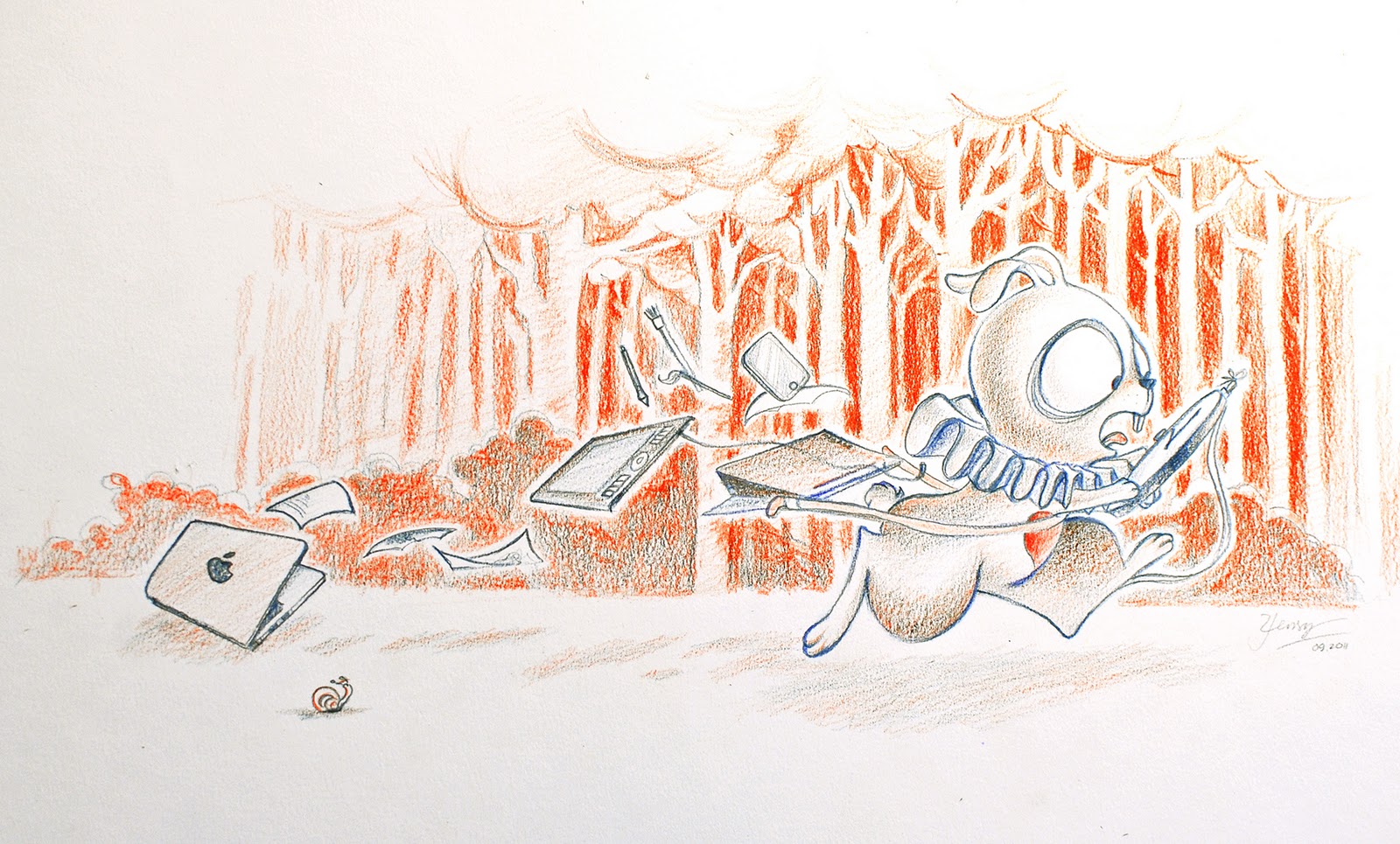
I like this one, too. But now I see a graphic novel in animation. Keep playing with it....


It became a children's book illustration. It's funny that I ended up coming back to children's book style.
I see a village with a small isolated house. There is smoke coming out of the chimney, and a sheep munching grass outside...
Ok, I need to come up with another plot for this.

Monday, March 21, 2011

Thursday, March 10, 2011

Tuesday, March 1, 2011

Bulldog clip type

I found a box of bulldog clips in the corner of my drawer. So I play with it a bit.

Sunday, February 27, 2011

Black window

One more for my Rainbow window collection. Now I miss yellow and pink.

Sunday, February 13, 2011

Abstract landscape.


I bought The Adobe Illustrator CS5 WOW! Books for a couple months. And here is the first thing I did to learn some new tricks from it. 

Friday, February 11, 2011

Thumbnails


These are some thumbnails for my next painting. I actually have more than 50 of these. I just mix the colours randomly, scan it and zoom in to find interesting compositions.
I have been wondering if I can improvise in paintings. I think it should be spontaneous, not a project with every single step planned. However, I'm not sure if having these thumbnails prior to start the painting is still improvising.

Wednesday, February 9, 2011

Silent

I have been playing with words. It is fun, as much as drawing or painting.

Friday, February 4, 2011

Photographer


A very interesting photo I took at the MoMA, New York. I didn't have enough time to  see everything in the museum. Neither did I have the chance to go check that stairs out. The photographer is a total stranger to me. He was taking photo of a couple sitting on the stairs. And I was on the other side of the building admiring an installation on the lower floor. When I looked up, I realized I only have a few minutes before they walked away. I missed a more dynamic pose of him while taking my camera out of the bag but got this. We never crossed paths later.
This is one of a few photos that I will frame on my wall.

Wednesday, February 2, 2011

Snow storm

After the storm, Montreal is covered with a heavy blanket of snow. Brrrrrrrrr.....

Sunday, January 30, 2011

aPoC

aPoC
20" x 30", acrylic on canvas.
A painting I did for a special request. It is obviously very different from most of my works. However, it is refreshing doing something out of the routine.

Saturday, January 15, 2011

Solitude 1


Many people have told me my artworks would look very cool in living rooms if they were bigger. I totally agree but I just couldn't work on anything bigger than 15 inches because of many reasons. Most of my works are illustrations that need to be reproducible. Thus, they should be in sizes that can fit in the scanner I have access to, which is around 19 inches by 15 inches. 
When I frame some of my favourite works, I wish they were bigger, too. It reminds me I am an painter before an illustration. My works don't have to be reproducible all the time. I wanted to do a big painting for a long time but haven't had any inspiration. One day I think I should stop waiting for inspiration and just start it. After doing some sketches on paper and in Photoshop, I finally had an idea for the painting: a semi abstract image of a granite quarry. This is what I finish. It is not semi abstract at all, and looks like an illustration more than a painting I had in mind. It is totally not a granite quarry either. But I am happy with it. It is fun to work on something that takes shape on its on.
The size is just 19 inches. However, it is actually big when I have to paint the under layer with my fingers and colour pencils on top. I took a photo of it. The colour aren't correct but I guess that's ok for now. This is a good start. Next time I will work even bigger.

Solitude 1